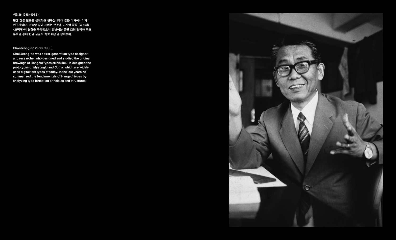
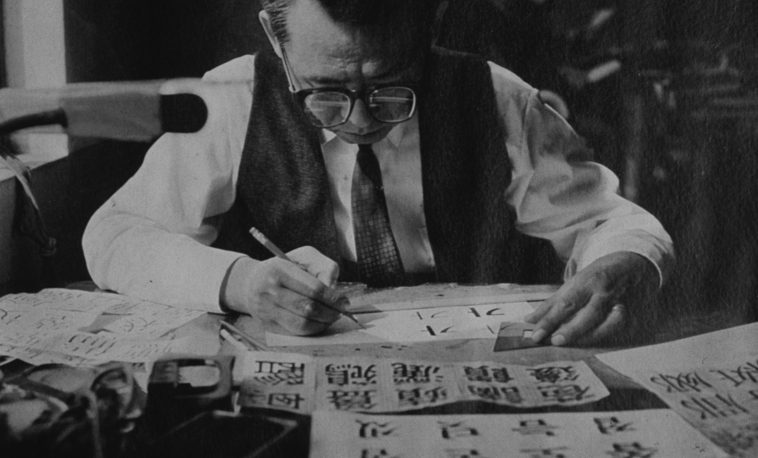
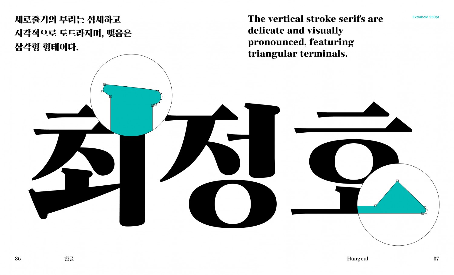
This book introduces AG Choi Jeongho Sun Myeongjo, a digital revival of the display serif typeface “Choi Jeongho Sun Myeongjo”, originally designed by the Korean type designer Choi Jeongho (1916–1988). The Sun Myeongjo style adapts the features of the Chinese Ming typeface (Myeongjo in Korean) into Hangul. Influenced by traditional brush calligraphy, it is characterized by thin horizontal strokes, thick vertical strokes, and triangular terminals at the ends of horizontal lines and the tops of vertical stems.
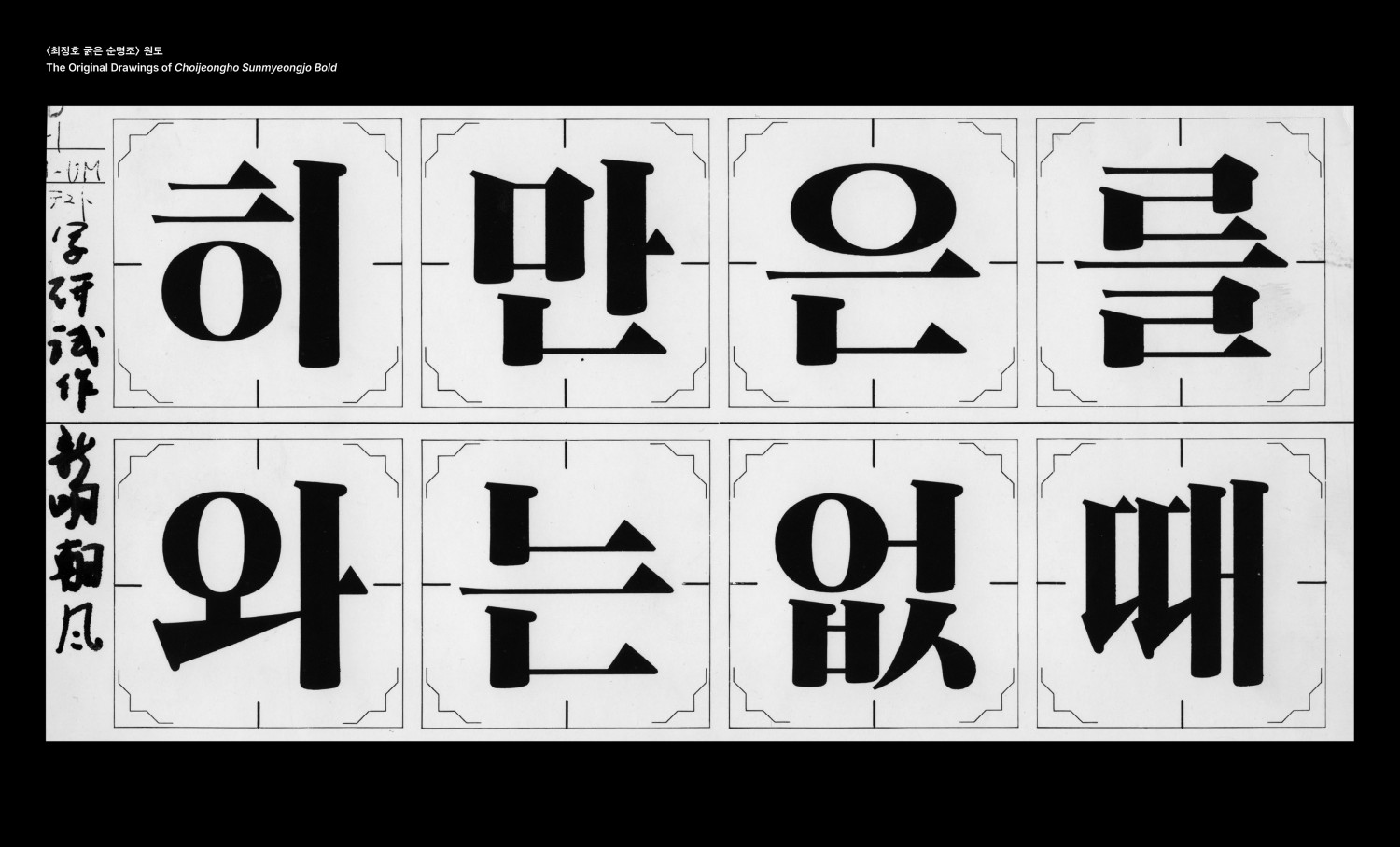
The typeface commonly referred to today as Myeongjo differs from the original Sun Myeongjo; its lineage traces back to Choi Jeongho’s own typeface. While Sun Myeongjo was once the representative form of Myeongjo, it gradually fell out of mainstream use following the emergence of the Choi Jeongho typeface. Choi Jeongho Sun Myeongjo—literally meaning “the original Myeongjo”—is Choi’s reinterpretation of the archetypal Myeongjo. In this publication, the original design drawings are revealed to the public for the first time. The AG Choi Jeongho Sun Myeongjo faithfully restores the historical context and typographic essence of this “pure Myeongjo.”
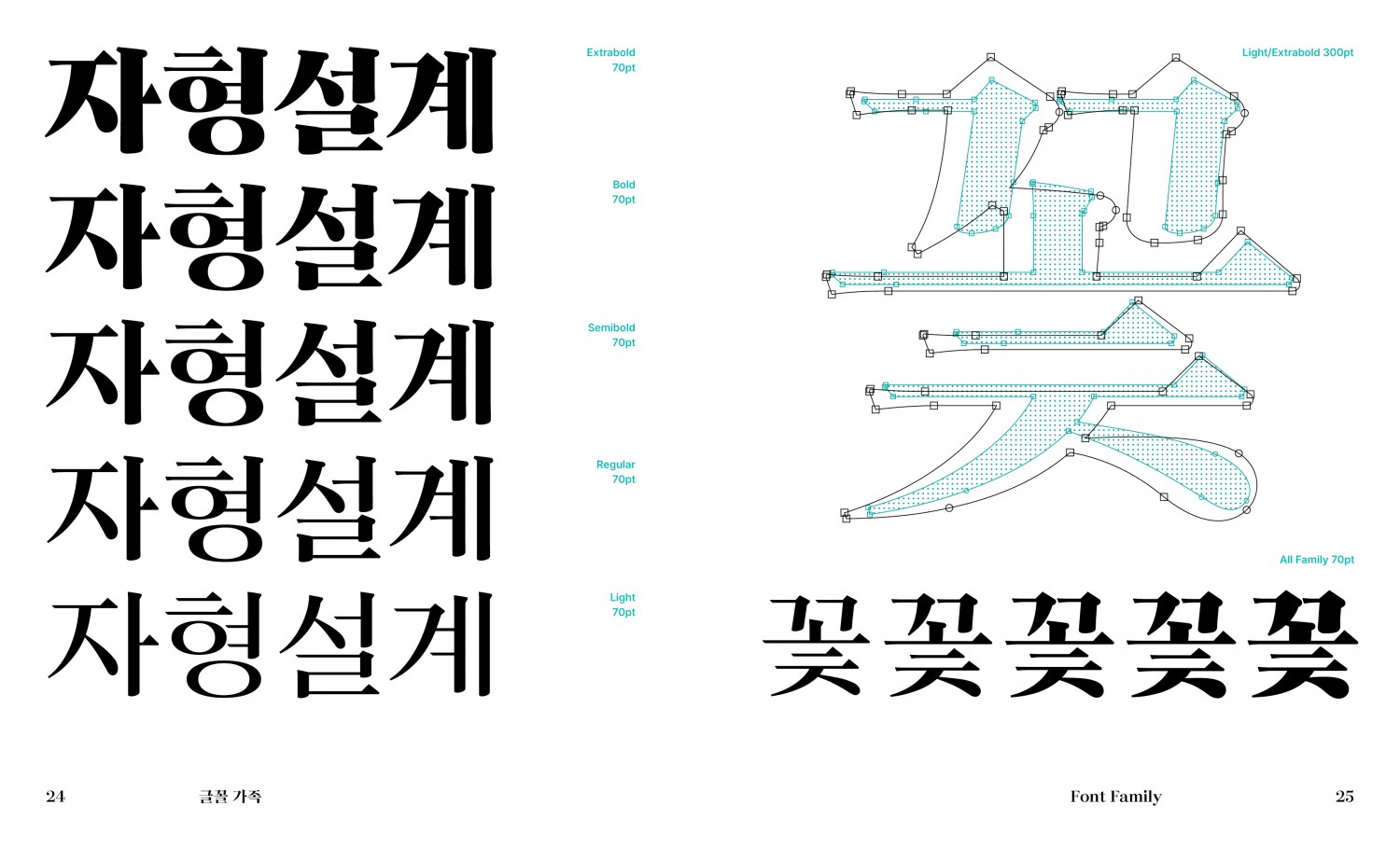
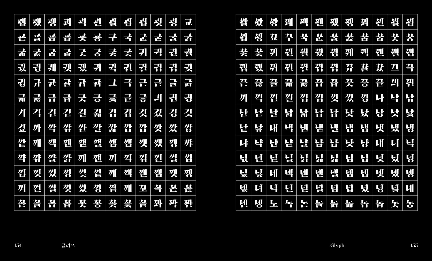
The typeface features bold contrasts between thin horizontals and thick verticals, reflecting its roots in brush forms. While structurally closer to a Gothic (sans-serif) style, it retains the atmosphere of a Myeongjo. The digital font includes 2,780 Hangul characters, 339 Latin characters, and 1,047 symbols, expanding from the single original weight into five styles, from Light to Extrabold.
Through abundant visual materials, the book explores the formative characteristics of the original drawings, the method of weight design, and the subtle adjustments of structure, proportion, and stroke modulation in each character. It further illustrates variations in visual density across weights, examples of typesetting and layout applications, and case studies demonstrating how the typeface can be effectively used in both display and text settings.