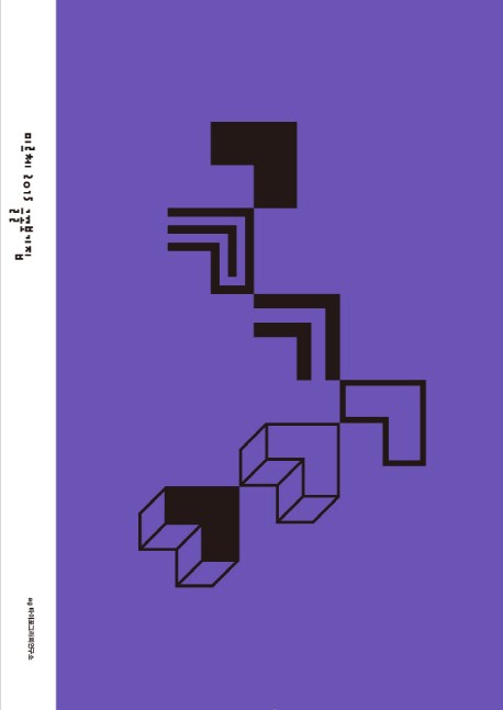
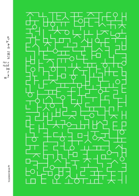
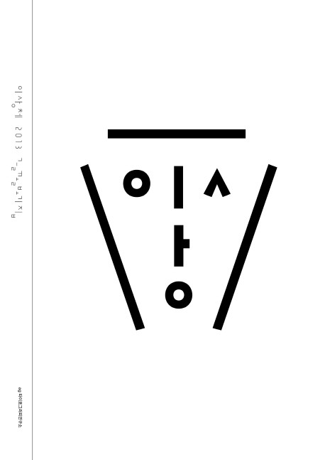
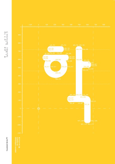
Fresh, Solid, and Diverse
A Series Exploring the Fonts by AG Typography Institute
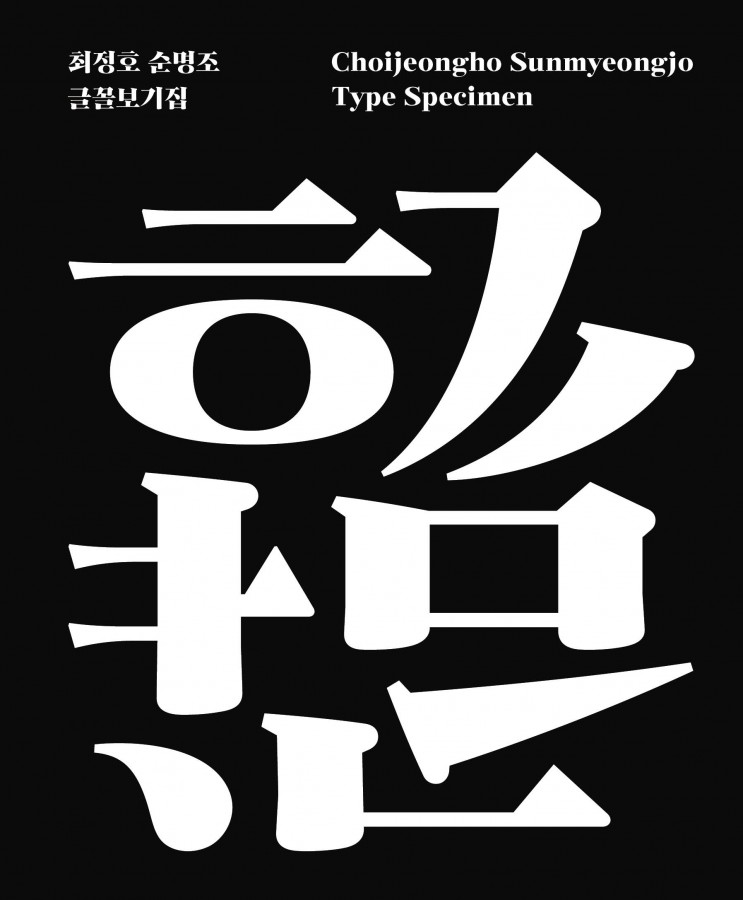
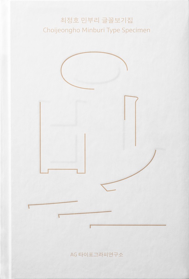
How are font types designed? What balance and aesthetic do they embody? Where do they perform best in the most meaningful way? The AG Type Specimen Series seeks answers to these questions, delving into the design and application of fonts created by the AG Typography Institute.
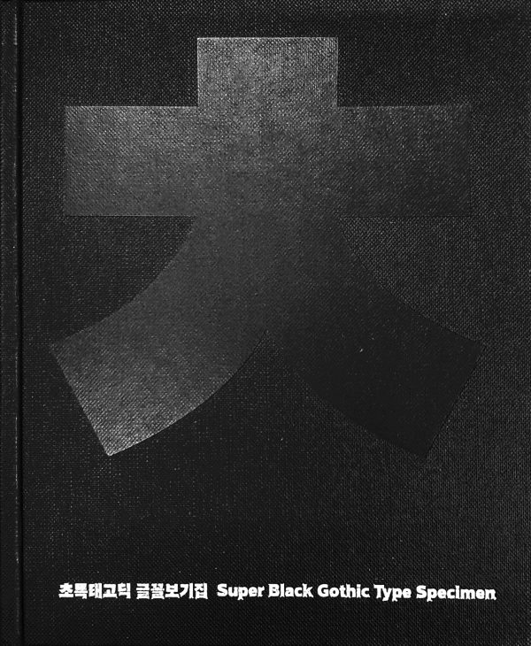
The Super Black Gothic Type Specimen is an introduction to AG Super Black Gothic. Super Black Gothic is a standout Hangeul Minburi (sans-serif) typeface designed by Hangeul designer Choi jeong-ho, with very bold stems that create a strong and powerful impression. AG Super Black Gothic Std. is a digital font created from Super Black Gothic’s original design. The book contains information on AG Super Black Gothic Std. features, how to calibrate the weight, and space allocation. It also contains a collection of glyphs, along with new Latin alphabet, numeral, and symbol typefaces that were created to match Hangeul.
