Ahn Graphics

Mano 2014 Type Specimen

마노체 2014 글꼴보기집

Buy

Fresh, Solid, and Diverse

A Series Exploring the Fonts by AG Typography Institute

How are font types designed? What balance and aesthetic do they embody? Where do they perform best in the most meaningful way? The AG Type Specimen Series seeks answers to these questions, delving into the design and application of fonts created by the AG Typography Institute.

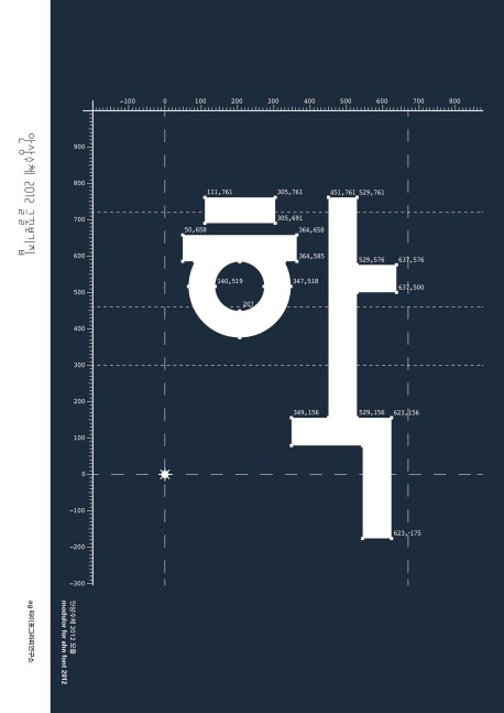
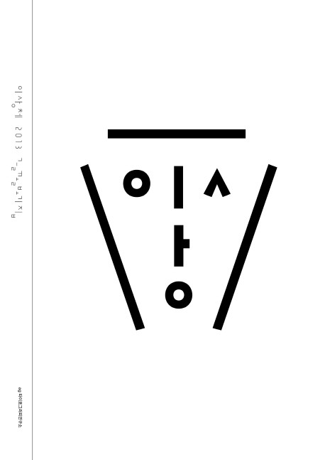
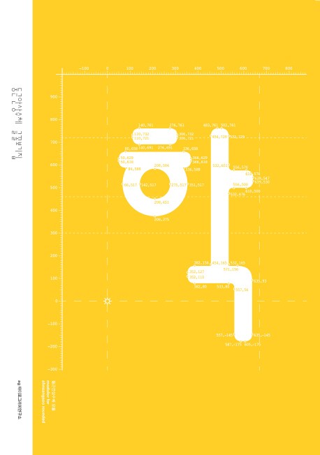
Mano 2014 Type Specimen is a book that introduces the Mano 2014 font, which was created by expanding Mano designed by Ahn Sang-soo in 1993. It contains the process of deriving the weight, visual correction of Hangeul, and the addition of symbolic fonts in one book, and also contains Ahn’s various works using the early Mano.

This is a full-fledged introduction to the subject of fonts, following on the heels of Ahnsangsoo 2012 Type Specimen, Ahnsangsoo Rounded Type Specimen, and Leesang 2013 Type Specimen, and it is written in both Korean and English to broaden the scope of the reader.

Ahn Sang-soo

Ahn Sang-soo is a graphic designer and typographer with a keen interest in Korean visual culture. He studied in the Visual Communication Design Department at Hongik University, where he also completed his graduate studies. A former professor at his alma mater, he took early retirement in 2012 to establish the Paju Typography Institute, where he currently serves as the president, also known as ‘Nalgae.’ In 2007, he received the Gutenberg Prize from the city of Leipzig, Germany. He is also a visiting professor at the Central Academy of Fine Arts (CAFA) in Beijing and a member of the Alliance Graphique Internationale (AGI).

Noh Eun-yu

Font designer and researcher. She founded Notype in 2018 and has been creating letters based on research and experimentation since then. She teaches typography at Konkuk University, Ewha Womans University, and Hongik University. She graduated from Hongik University’s Department of Visual Design in 2006, and received her master’s degree in 2008 with a thesis on “A study on the Hangul phonetic alphabet system for phonetic transcription of Japanese” and her doctorate in 2011 with a thesis on “A study on the morphological characteristics and lineage of Choi Jeong-ho’s Hangeul typeface” from the same graduate school. In 2017, She studied Latin design at the Royal Academy of Arts in The Hague, Netherlands. She is the co-author of Hangeul Designer Choi Jung Ho (2014), Glyphs Type Design (2022), and His representative fonts include Optique (2019), Sori (2020), NAVER Maru Buri (2021), and Climate Crisis Font (2022).

Noh Min-ji

She is a typeface designer based in Seoul. She received her master’s degree from Hongik University Graduate School with a research on Korean punctuation. He has been working as a typeface designer at the AG Typography Institute since 2012, after having worked at the Yoon Design Institute. She has developed typefaces such as Boeunche, Maleungullimche, and Bomnunche.

AG Typography Institute

AG Typography Institute was founded in 2012 as an affiliated institute of Ahn Graphics. We designs and develops typefaces based on in-depth studies, and aims to create new typeface culture and trend.
은 안그라픽스에서 발행하는 웹진입니다. 사람과 대화를 통해 들여다본
을 나눕니다.