Fresh, Solid, and Diverse
A Series Exploring the Fonts by AG Typography Institute
How are font types designed? What balance and aesthetic do they embody? Where do they perform best in the most meaningful way? The AG Type Specimen Series seeks answers to these questions, delving into the design and application of fonts created by the AG Typography Institute.
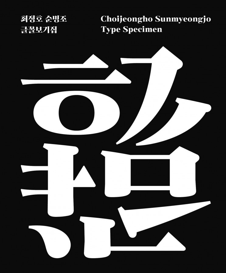
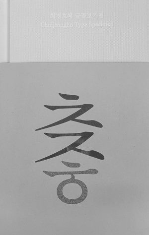
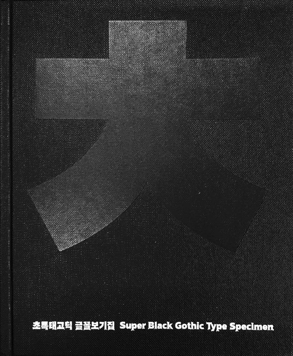
The ChoiJeongho series is the story of the results of a project to recreate the original font of Choi Jeong-ho, a first-generation font designer, type designer, and researcher who designed and studied Korean fonts throughout his life. “This is the third font collection of the Choijeongho Minburi Type Specimen, following the Super Black Gothic Type Specimen and the Choijeongho Type Specimen. We will continue the series with pro versions of the fonts in the future.
A project to recreate the original Minburi design by the first-generation Hangeul designer Choi Jeong-ho
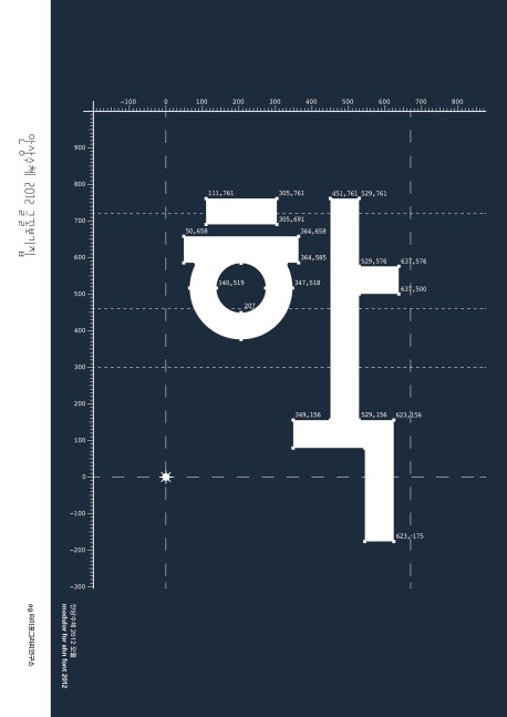
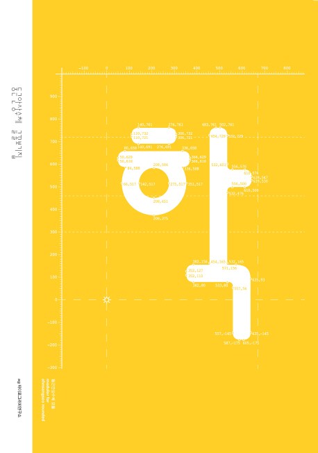
Minburi is a Minburi family font for text designed by Hangul designer Choi Jeong-ho in his later years. A part of the original design is included in the original text, and AG Choijeongho Minburi Std. is a digital font recreated based on 1,058 finished characters out of 1,353 original characters. This book contains the overall story of the font, including the overall shape, size, proportion, space, width, stroke-by-stroke feel, and rules of use for 2,574 Korean characters, 298 Roman characters, and 782 symbolic characters including punctuation marks. It also provides a guide for users to use the font more beautifully through the engraving part, which shows various applications of the font.
In order to design the contents and cover of the book with the feel of the fonts, post-processing that has not been tried in other books and the choice of paper to convey the feel of the fonts by hand were also taken care of. As a work of art, it will be a book that will bring value to readers over time.