Seeing, Reading, and Feeling Type
We read words and sentences, but as long as letters are meaningfully arranged, we often overlook the aesthetic value of typefaces. When encountering a foreign language or unfamiliar typeface, we begin by seeing forms—circles, lines, interiors, and exteriors.
Typography isn’t just about reading—it’s also about seeing. Adrian Frutiger transcended conventions to design the Devanagari New Style typeface for Indian scripts, much like the pioneers of modern typography broke free from tradition to redefine typographic forms.
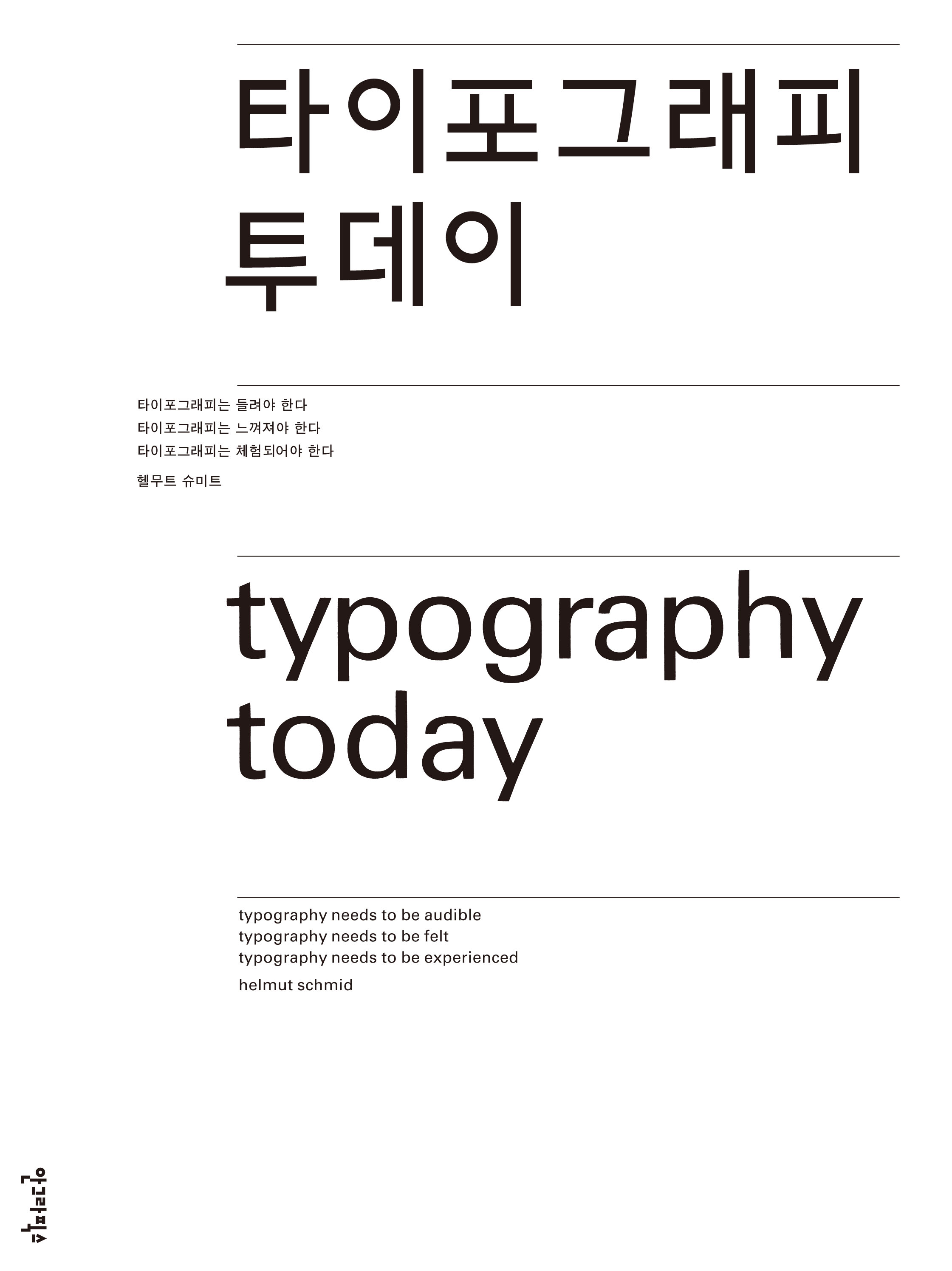
Similarly, Helmut Schmid works with scripts he cannot read, such as Japanese. For him, Japanese text is not a readable message but a visual one. As a result, the shapes of letters are strongly emphasized. His designs for Japanese katakana characters originate from their visual appeal. While ideographic characters convey visually readable messages, phonetic characters merely exist as forms.
Typography must do more than be seen and read:
- Typography needs to be audible.
- Typography needs to be felt.
- Typography needs to be experienced.
Today, typography is not merely about arranging text—it is about expressing it.
