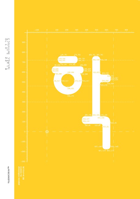
Fresh, Solid, and Diverse
A Series Exploring the Fonts by AG Typography Institute
How are font types designed? What balance and aesthetic do they embody? Where do they perform best in the most meaningful way? The AG Type Specimen Series seeks answers to these questions, delving into the design and application of fonts created by the AG Typography Institute.
The Hangeul writing font has become even stronger and richer
A look at ‘Leesang 2013’ as a book
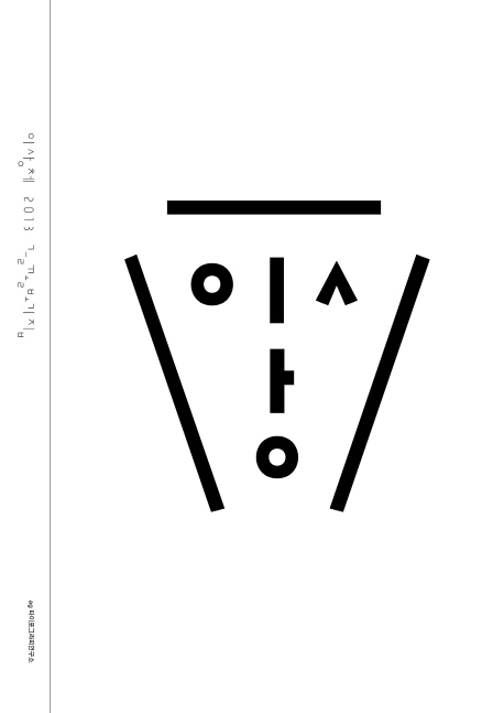
This book is an introduction to Leesang 2013, which is a revised and refined version of Leesang, a Korean writing font. First published in 1991, Leesang is a font inspired by the surrealist colors of Yi Sang, a modern novelist and poet known for his works such as “The Wings” and “Crow’s-Eye View,” and features a unique Korean writing structure that deconstructs the Korean alphabet and arranges the first, second, and third letters diagonally.
In Leesang 2013 Type Specimen, you’ll find the new Leesang 2013 type forms, type families, visual correction, symbolic type, and recommended sizes for viewing the font, as well as a printout of a poem quoting the above, and a variety of other works using early Leesang. This is a full-fledged introduction to the subject of fonts, following on the heels of Ahnsangsoo 2012 Type Specimen and Ahnsangsoo Rounded Type Specimen, and it is written in both Korean and English to broaden the scope of the reader.
