The Foundation of Hyundai Card Design and the Birth of Brand Identity
A 20-Year Archive of the ‘Youandi’ Typeface Project
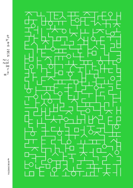
Our Typeface is an archival book documenting the evolution of Hyundai Card’s typeface project, which has been the bedrock of the company’s design and a key element of its brand identity. The book celebrates the 20-year journey of the ‘Youandi’ typeface, highlighting the three major phases of development and its profound impact on Hyundai Card’s design and branding. The book is organized into three sections: “Three Eras,” a type specimen showcasing the distinct features of the ‘Youandi,’ ‘Youandi Modern,’ and ‘Youandi New’ typefaces; “Thoughts,” which contains professional perspectives; and “Expressions,” a collection of case studies of the typeface in use. This structure allows designers, branding professionals, marketers, and general readers to explore the content according to their interests. The book’s design also reflects the essence of ‘Youandi,’ using the 1:1.58 aspect ratio and grid system inspired by the Hyundai Card plate, the starting point of Hyundai Card’s design journey.
The ‘Youandi’ typeface was first developed in 2003 as a display font for Hyundai Card’s corporate identity (CI). The strategy behind creating this exclusive corporate typeface was to use it for the new CI while maintaining visual consistency across various products and branding efforts. ‘Youandi’ quickly became a core element of the company’s identity as a leverage for branding—it has helped build a consistent visual system and deliver clear messages through its iconic and aesthetic characters. Moreover, ‘Youandi,’ which immediately sparked a trend of custom typeface development in Korea, has since become the cornerstone of Hyundai Card’s design system, thereby serving as the company’s ‘unique voice’ that expresses its philosophy. Having a visual voice to convey the company’s message is, ultimately, the pinnacle of branding.
