Geuljassi No. 28 is composed of three sections: Papers, Features, and Contributions.
First, the Papers section includes five articles:
Min Bon’s “On the Implementation of Optical Sizing in Hangul Typefaces: Focusing on the Hwaljjak Myeongjo Project,”
Kwon Ji-woon’s “Interlingual Addressing and Graphic Design,”
Kang In-gu’s “Proposal of User-Defined Axes for Developing Post-Square Hangul Variable Fonts,”
Cho Joo-eun’s “Text.Tile.Textile: A Hangul Typography Experiment Expressing Text as Visual Fabric,”
and Lee Yong-je’s “The Meaning and Method of Reproducing Early Original Types.”
These papers demonstrate the wide range of interests and depth of inquiry among today’s typography researchers. The authors hope that their studies will serve as clues and starting points for follow-up or expanded research and for the practice of theory.
Following the papers, Park Yoo-sun and Yoo Do-won’s opening essay, “Continuing to Observe Typography in the Present,” marks the formal introduction of Geuljassi No. 28.
The Features section is organized around two major themes: propaganda and branding.
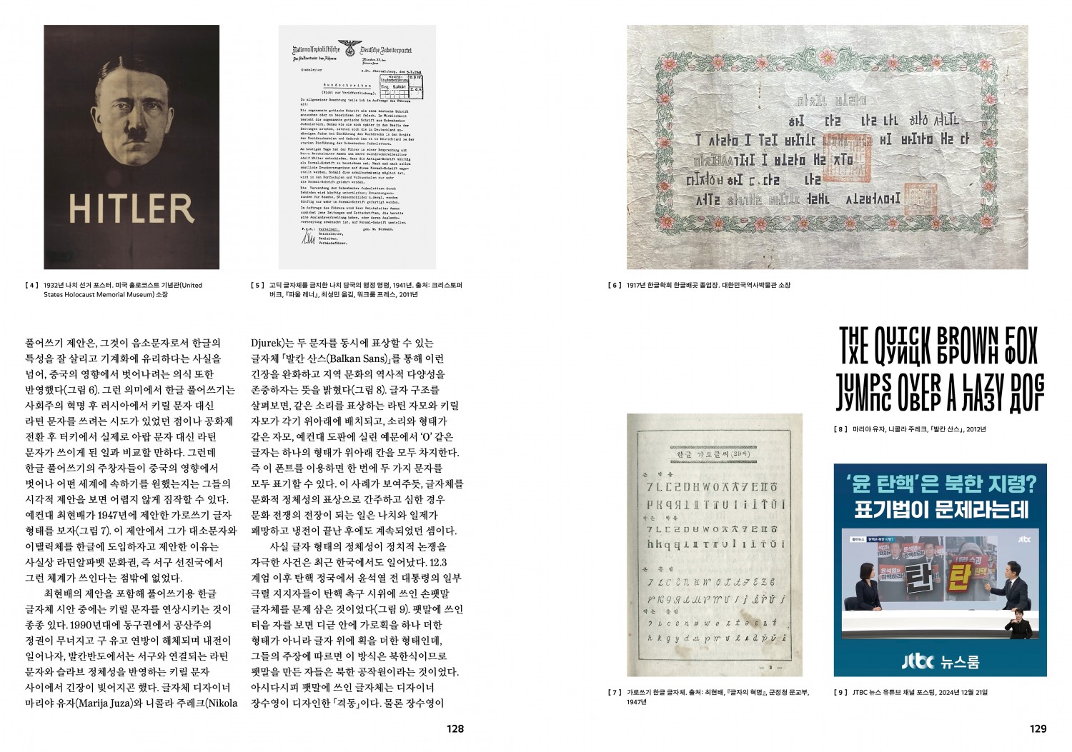
In Feature 1: Typography and Propaganda, Choi Sung-min’s “‘I write this by hand to express my sincerity’” revisits the relationship between politics and typography in history, from Constructivist typography to handwritten letters. In particular, it highlights several cases from recent domestic political unrest and presidential elections, analyzing the role of letters embedded in contemporary politics.
Sim Woo-jin’s “Revisiting the Project ‘Spirit of the Times’: Where Are We Heading?” is recorded in the form of an interview with Everyday Practice. Focusing on Spirit of the Times, a project planned by Everyday Practice, it identifies and examines six key characteristics of the project.
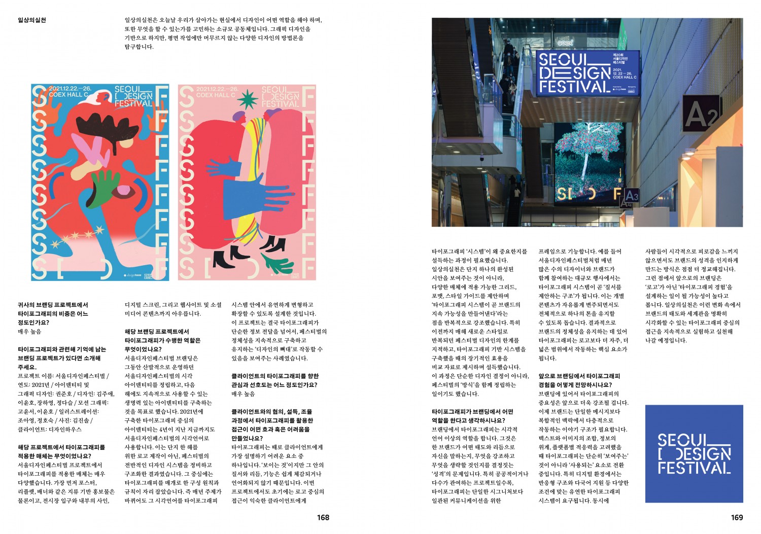
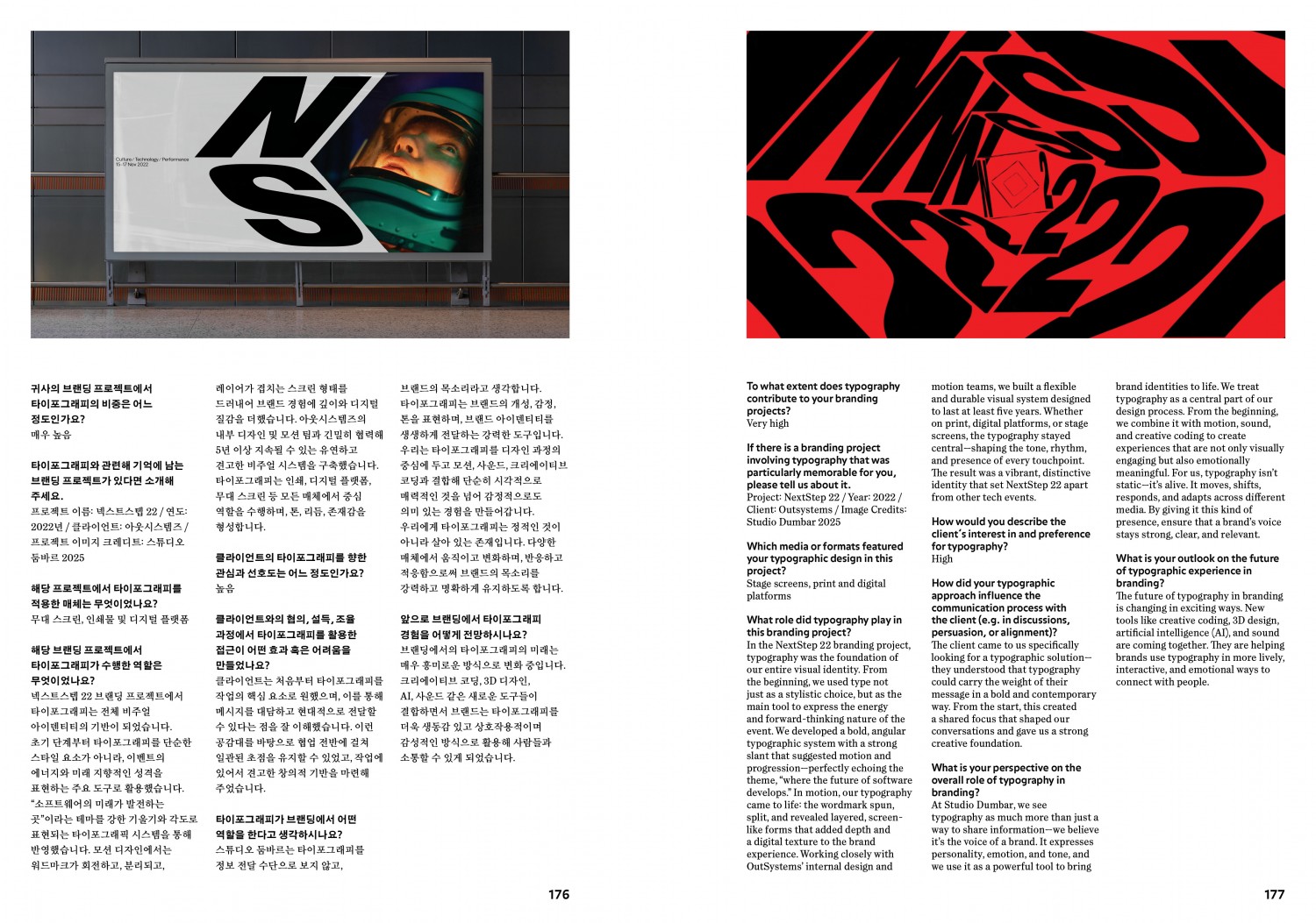
In Feature 2: Branding Strategy and Typography, Jeon Woo-sung’s “Typography, Another Element That Shapes Brand Recognition” examines the potential of typography as a powerful tool that enables brand recognition, assigns personality, and leaves a lasting impression.
Following this, “Collection: Branding and Typography 2025” presents a survey conducted among design groups of various scales, from design studios to agencies. Through this, it analyzes how typography is selected and utilized in actual branding practices.
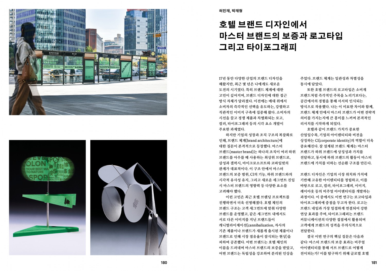
Heo Min-jae and Park Jae-hyung’s “The Master Brand Guarantee, Logotypes, and Typography in Hotel Brand Design” analyzes logotypes and typography cases of three global hotel chains—Marriott, Hilton, and Hyatt—to dissect how brand and typography operate organically to form a consistent experience.
The Contributions section selects three themes to explore various experiments and attempts.
In Contribution 1: Digital Typography Now, Seo Yoo-kyung’s “The 20-Year Journey of Typeface Design Protection” looks back on twenty years of the typeface design protection system and emphasizes the need for designers to develop rights protection strategies.
“Figma, Digital Typography,” presented as a dialogue between Chris Hamamoto and Johan Prag, discusses the beginnings and present of Figma—now established as a major tool in digital design—based on their shared experiences working there.
In Contribution 2: Digital Typography and Typeface Design, Si Cheong-yang’s “Reinterpreting the Tangut Script: A New Paradigm of Digital Typeface Design for Extinct Writing Systems” reports on research that reconstructs the extinct Tangut script as a digital typeface. This Tangut script restoration project gives new typographic life to an extinct writing system and proposes possibilities for its future use.
Kim Joo-kyung’s “Exploring the Potential and Formative Practice of Post-Square Hangul” sheds light on the formative possibilities of post-square Hangul and its expandability as a design system, introducing AG Typography Lab’s structural experiments in Hangul typography through international collaborations and educational practices.
In Contribution 3: Typography Events, the first topic, Perspecta 56: Not Found, is a New York Type Directors Club (TDC) Communication Design Award-winning work.
Mike Turley and Cat Wentworth share their process of experimenting with the materiality of typography and print, exploring between concealment and revelation, visibility and invisibility.
Kim Min-kyung and James Goggin, winners of the Tokyo TDC RGB category with Who Are We Now?, extend their work across three forms—print, audio, and web—to explore the reading experience as a whole.
Sim Woo-jin recounts his experience serving as a judge for the newly established Hangul category in the Morisawa Type Design Competition (MOTC) 2024, and includes all of the award-winning works at the end of the piece.
Finally, Seok Jae-won’s “Systematization for Novelty: Typeface Designer Kim Tae-ryong’s Solo Exhibition ‘Pyeonsan’” examines Kim Tae-ryong’s persistent inquiry, tracing his exploration from the typefaces Sanyuhwa and Sanjak to Pyeonsan, presented at his solo exhibition.