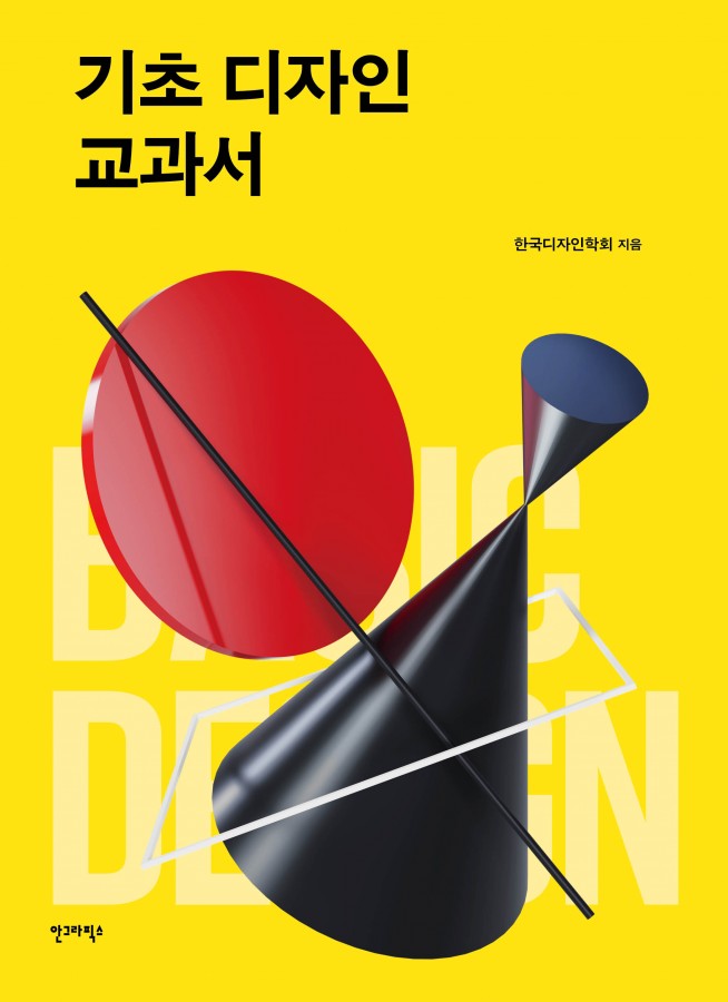
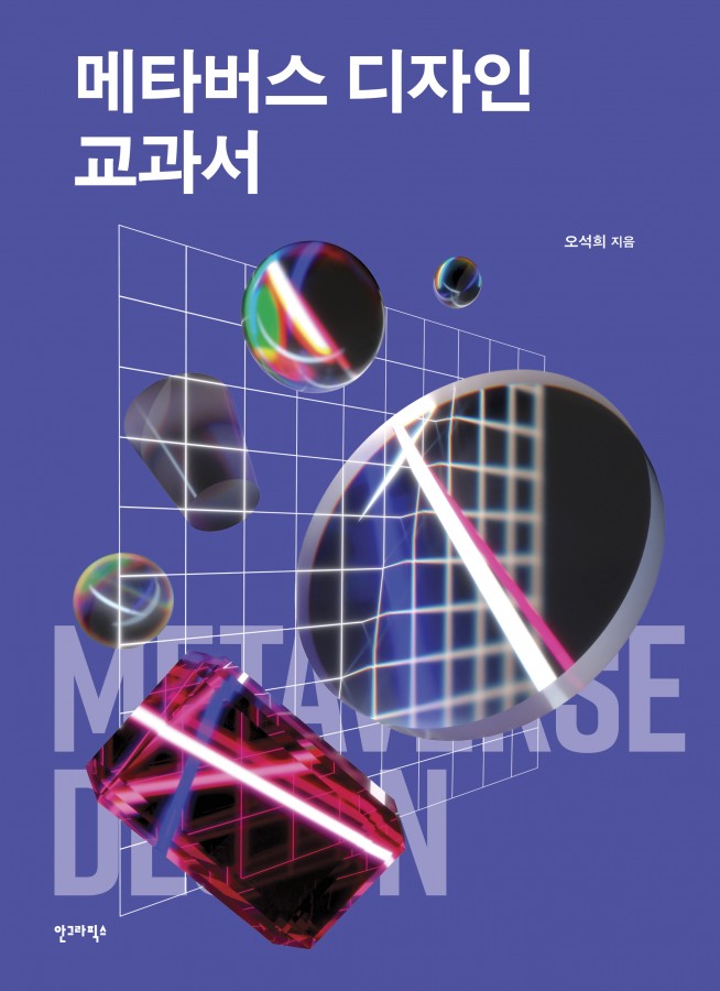
This book is a revised and expanded version of Hangeul Design, originally published in 1997, updated to reflect contemporary demands and changes in the environment while incorporating the evolving spirit required by Hangeul typefaces today. As a result, the book has been renamed Hangeul Design Textbook. At the time of the original publication, the term “Hangeul Design” was narrowly understood as “Hangeul type design,” or simply as lettering—the act of drawing Hangeul letters to appear beautiful or distinctive. The book’s title, Hangeul Design, was chosen to emphasize the significance of Hangeul’s functionality as a script and to highlight the spirit and principles underlying its design.
Fortunately, people now seem to understand the broader significance of Hangeul Design as type design. Over time, the value of Hangeul’s spirit and principles as part of Korea’s design ethos has become clearer. This has led to the realization that “Hangeul Design” should not be narrowly confined to type design but instead reflect the spirit and principles inherent in Hangeul itself.
Hangeul is distinct from other scripts as it was meticulously designed from the outset, embodying the spirit of its era. The evolution of Hangeul typefaces has also been driven by this zeitgeist. Concerns about mechanization and efficiency led to the creation of the three-set keyboard, while efforts to improve readability combined with these advancements resulted in the proliferation of non-square typefaces. Technological innovations addressed the demand for diverse Hangeul typefaces, which are now used to express personal and corporate identities.
The rise of online media necessitated the adaptation of Hangeul typefaces to new platforms, leading to a shift in the perception of body text typefaces. Furthermore, the flourishing of online media spurred a demand for emotional, playful, and vibrant Hangeul typefaces, which the industry has met. During this transition, the concept of “purchasing Hangeul typefaces” also became widely accepted, giving the impression that the development of new Hangeul typefaces might no longer be necessary.
However, we must revisit the question of what kind of Hangeul typefaces are needed today. Recognizing Hangeul as the foundation of our culture and Hangeul typefaces as the cornerstone of our visual culture, we must strive to enhance the aesthetic and functional quality of the diverse range of existing typefaces. We should also consider typefaces that support coexistence among all forms of life, including humanity. This is the essence of creating Hangeul typefaces for our time.
This book provides a detailed guide to the foundational attitudes and methods for designing Hangeul correctly. It not only points toward the proper direction for Hangeul design but also helps visual designers cultivate the discipline and mindset required for advanced creative processes. Furthermore, it aims to serve as a guidepost for those designing with Hangeul, fostering a deeper understanding of Hangeul culture for everyone who cherishes it.

